This week in Art 110, the galleries were filled with beautiful paintings and drawings. Just like last week, I really enjoyed seeing paintings in the galleries. All of these artists showed such intricate designs within their paintings and just the amount of detail they had put in stunned me.
This week, I had found a big interest in “Untitled Landscape IV” by Sarah Walsh.
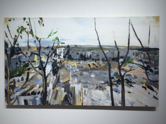
For some reason if reminded me of Chernobyl. This landscape looked so deserted and the strokes they used to paint seemed very short, which gave the illusion of broken pieces. The trees shown in the front seem very bare so it also added to its desolation.


I always thought that Chernobyl was such an interesting place. The story behind it is almost like the ones in a comic book. I remember watching a documentary on it in high school which explained that even the animals left around that area have a pretty high count of nuclear activity. I thought this was so crazy! They’re like mutant animals that just walk around, except they look totally normal. Chernobyl is clear of werewolves, I promise.
The colors used in the piece usually come from the cool side. I think the yellows and browns she used really compliment the cool colors. Besides it being right across from the cool colors on the color wheel, it really gives it to the pop color that ties it altogether. I love how the strokes really give it the more contemporary and industrial feel on such a natural landscape piece. I liked the way she had incorporated these two ideas.
I love when this happens in art. When I can take my own knowledge and apply it to art. This way it gives me a perspective I am comfortable with in order to figure out what perspective the artist is playing from. It makes understanding art easier and makes it easier to relate to.
